
Tuesday, 20 December 2011
Thursday, 15 December 2011
Flat Plans...
Below are my flat plans of my front cover, contents and double page spread. I have roughly drawn out where I would preferable like everything to be and have put all my ideas together to create these three rough sketches as a guide to help me when I come round to creating them on the computer.

I plan for my front cover to have the masthead uncovered by any images/coverlines. I may decide to have it in a coloured box, I want it bold and eye catching. I plan for my image to be in the centre of the page, with coverlines either side of it, making it have a sort of symetrical effect. Also, I would like to have a suitable amount of coverlines so it doesnt come across as looking 'overcrowded'. I plan to try and make all the main coverlines stand out, possibly by putting them in boxes/circles, or by having them in a different font to the rest.

I plan for my contents also to have the title uncovered and eye catching. I would like my main image to be on the left/centre allowing room for the main contents information. Also on my contents, I would like there to be a mixture of both images and text, rather than it just being a page full of page numbers and writing. I plan to have pictures of the pop artists that would feature in my magazine down the right hand side. Some ideas for the contents of my magazine include; hot posters, new artist profiles, awesome competitions, album review and concert dates.

This is my plan for my double page spread, again I want a clear title and a mixture of both images and text. I would like the main image to be on the left, with the interview (text) justified to the right of the image. I plan to include boxes/circles to help to highlight some of the main bits and make them stand out from the rest; including the main quote, concert dates and possible new album or single.
Storyboard of Shots

 Here are my story boards of shots that I plan to take when carrying out my photo shoot. Underneath each drawing I have listed some of the key mise-en-scene elements. This is helpful as it helps to prepare me as to the type of photos I may take, it is only a rough plan, but I will keep all these 8 shots in mind when taking my images. By doing this, I was able to gain more of an idea as to what poses I like, and when I do my photo shoot I will be more confident as I now have more ideas that are continuing to develop.
Sunday, 11 December 2011
Media Theories!
When creating my magazine, I have to take the different media theories into consideration, one of the main ones being ‘Audience theory’. Audience theory helps to show the vast change within media over the years, and there are lots of different concepts within.
Hypodermic Needle Theory is the idea that media can easily influence a large group of people without any opposition. It was believed that mass media can ‘inject’ messages directly into its audience, who will immediately be influenced by it. In contrast to this, Halloran stated ‘We must get away from the habit of thinking in terms of what the media do to people and substitute for it the idea of what people do to the media’.
The quote is suggesting that people are now getting a lot more involved as to what they want in the media. It tells us that instead of just passively accepting the media we are now more involved and can interact with it. Nowadays, we have a choice as to what media we want to experience, whereas before people had no choice, we can be more selective about types of media, and people nowadays influence the media more, rather than before when the media was massively influencing us.
The Two Step Flow theory is the idea that media starts off with individuals (opinion leaders) who pass on their interpretations/ personal influences of the media to others. It states that the majority of people are influenced by the media second-hand, through the beliefs and personal experiences of the opinion leaders.
C.Wright Mills came up with four functions of the media for its audience:
- give individuals identity
- give people goals and aspiration
- give instructions on how to achieve these goals
- give people an alternative if they failed (escapism)
When creating my front cover, contents and double page spread, I am going to take all the media theories into consideration. I want my magazine to be unique and have a ‘diversion’ in order to get people to escape from their everyday lives. Also, I want my magazine to have a sense of ‘surveillance’, so my readers can know what’s going on in the world of pop, in order to give them goals and aspirations they may wish to achieve, and points on how exactly their goals can be achievable.
Thursday, 8 December 2011
Risk Assessment
Risk Assessment for my photo shoot:
I am planning on doing my photo shoot in my house, preferable in a room with white walls. Below is my risk assesment, it ensures that my photo shoot will be carried out safely, I have identified some of the possible risks and then ways in which I could prevent it from happening. I decided to include this to show that my photo shoot will be carried out safely, and hopefully reducing any problems from occuring.
RISK | PREVENTING RISK |
Falling down stairs | Make sure we take care when walking down and up the stairs |
Dropping camera equipment | Make sure the camera is in a case until it is needed |
Tripping over dogs | Make sure the dogs are out of the room when taking the photos |
Hurt self when moving furniture about | Make sure we move it about carefully and slowly |
Getting fingers trapped in doors | Make sure we take care when walking in and out of rooms |
Dogs may ruin the photo | Make sure dogs are out of sight to avoid them ruining any of the photos |
Might trip over junk on the floor | Make sure the house is tidy with no obstacles that we may end up tripping over |
Tuesday, 6 December 2011

Saturday, 3 December 2011
Masthead Ideas


I came up with three different masthead ideas. Each of which are slightly similar but with some slight differences to it. I think the top one is quite girly and would suit well, however I believe that it isn't really bold enough. I want my masthead to be extremely clear even at distant so if on a magazine shelf, it would be immediately seen. The second masthead is my chosen one, I think it stood out the most, it is very clear and bold, and I think the bold capitalised letters stand out a lot. I don't really like the last idea, I don't think it stands out enough. It is a very girly font, but I don't think it would work well as the letters aren't bold enough and it isn't as eye catching.
Thursday, 1 December 2011
Hand Drawn Logo/Mathead Ideas.

Tuesday, 29 November 2011
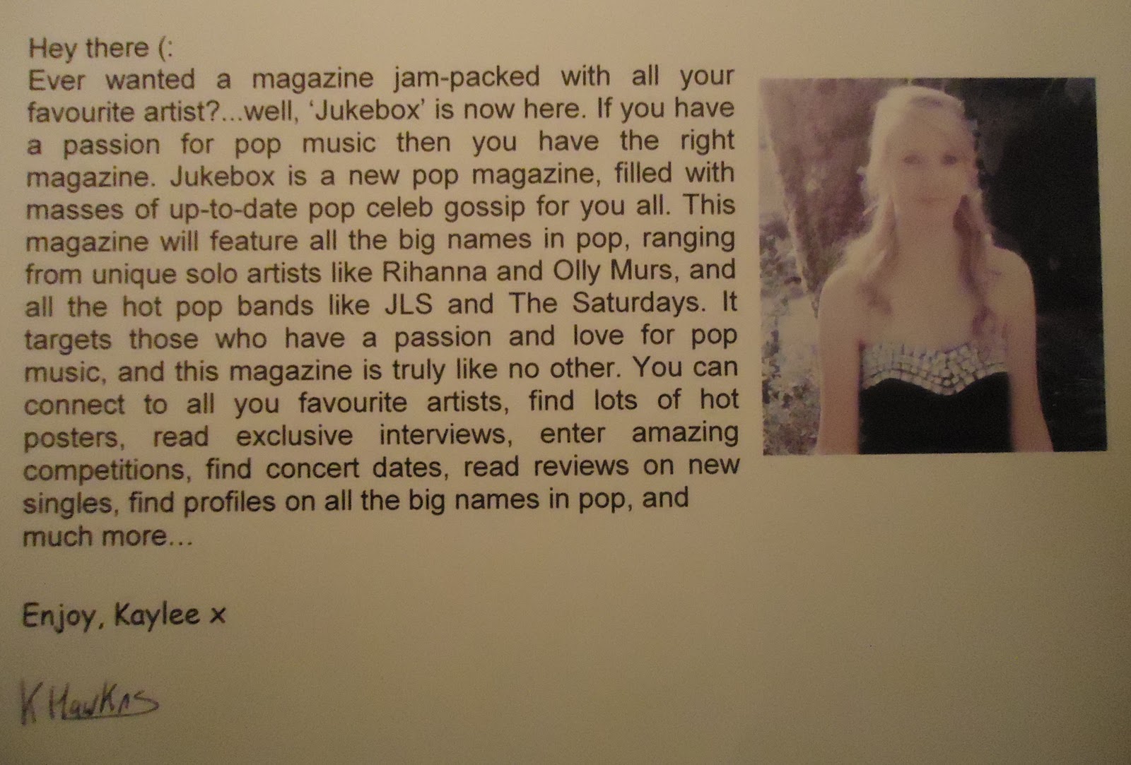
Customer Profile.
 This is Molly, she is 16 and currently in sixth form. She is studying photography, media studies and drama. In her spare time she loves meeting up with friends, and going out with her family. She is constantly listening to music, and it is very rare to see her without headphones in her ears. She loves pop music and always keeps up to date with the charts. Music is a big inspiration in her life, her favourite artists are Olly Murs and Rihanna. She also likes all the popular boybands, her favourites being JLS and One Direction. She is very passionate about live gigs, and often attends all the local concerts. In a magazine, she
would like to find exclusive gossip, concert dates and free posters.
Saturday, 26 November 2011
Advantages and Disadvantages of questionnaire.
Advantages:
The advantages of a questionnaire are that they are fairly quick and easy to do; people can easily take them away and complete them so it doesn’t waste lots of time. Also, by doing a questionnaire it’s a way in which you can get a range of lots of different people’s opinions, rather than it all just coming from me personally, and other people may have some good answers that influence me. A questionnaire is a very efficient way of collecting information, the results are very easy to present, and using pie charts helps to display results very clearly. Furthermore, because everyone completed the questionnaire alone, there was no pressure on them so hopefully no bias results.
Disadvantages:
The disadvantages are that some people may have misunderstood some of the questions, they may have ticked the wrong number of boxes for example. Also, the questions can’t be complex; they have to be kept quite simple so everyone, ranging from all different ages, is able to complete the questionnaire with no difficulty. It is hard to tell if people have actually answered the questionnaire truthly, rather than being influenced by others around them. Moreover, some people may even loose the question or even possibly write down silly answers that are completely unrelated. Finally, some people’s answers may not be given as an option which would mean they just had to pick from what was listed rather than it being their honest opinion.
Overall, I think that my questionnaire was very useful to me. I saw my questionnaire being more of an advantage rather than a disadvantage. I am going to take all my results into account when creating my magazine, and believe my results have been useful and have helped to influence me.
Questionnaire Results...
Above are the results from my questionnaire. I have displayed all my results in pie charts, making it very clear and simple. You can easily see what the majority of people voted for, and by doing my questionnaire it has helped to influence me with the creation of my magazine. By carrying out the questionnaire, I have got more of an idea of the colour scheme, masthead, layout, lures, and expectations of a pop magazine. However, I am still unsure about whether to have a guy or girl on the front cover of my magazine, and my questionnaire didn't really help as it turned out to be 50/50. I asked a variation of different age groups and genders to complete my questionnaire, but looking at the pie charts the majority were females who were aged 16-20, which could make my results slightly more biased towards that group of people. Overall, I think that by carrying out this questionnaire, it has been a good way to freely get other peoples views and opinions. I am going to take all my results into account, and will base the creation of my pop magazine upon them.
Thursday, 24 November 2011
Magazine cover montage...
Above is a slideshow of images to consider when creating my magazine front cover. I have collected images of different poses, fonts, lures, existing covers, mastheads and props and clothing. By doing this I have been able to get more of an idea of to what I want my cover to look like, and when I come to taking my front cover images, I can experiment with all the different poses I found to find the one that is best suited for my pop magazine cover.
Sunday, 20 November 2011
My Questionnaire:

<--- Here is a copy of my draft questionnaire. This helped me for when i came round to creating my final questionnaire. I have included a variation of different questions, enabling me to get lots of different peoples opinions on how I should create my magazine.
Below is a copy of my final questionnaire, which I have imported onto slideshare. I am going to give my questionnaire out to 10-20 people, to help me find out a variation of different peoples opinions on my pop magazine. My answers that I get from my questionnaire will help me with the production of my pop magazine, and it'll also help me to decide on a name and a colour scheme.
Below is a copy of my final questionnaire, which I have imported onto slideshare. I am going to give my questionnaire out to 10-20 people, to help me find out a variation of different peoples opinions on my pop magazine. My answers that I get from my questionnaire will help me with the production of my pop magazine, and it'll also help me to decide on a name and a colour scheme.

Ideas for magazine names

Thursday, 3 November 2011
Music Video
I have decided to put this music video on my blog as I believe that JLS are a big part of pop. They are usually in the pop charts and are very popular. I would expect to see them in pop magazines, and my target audience for my magazine may like reading magazines that they are featured in.
Sunday, 30 October 2011
Friday, 28 October 2011
Tuesday, 18 October 2011
Mood Board...

Above is an image of my music mood board. The genre of my mood board is pop, and I am aiming it at teenagers, mainly females. In my mood board, I have looked at the different artists that you would associate with pop, such as jls, rihanna etc. I have put examples of the magazine covers I like, and have annotated what I like and dislike about each of them. I have also experimented with some different font styles and colours which I could use for my magazine. Futhermore, I have included some album covers and photos of pop celebrities, which could give me an idea about what position I could get my person on the front cover to stand/pose like.
Conventions of magazine covers include:
- Masthead
- Brand Identity
- Lure/Hook
- Selling Line
- Mode of Address
- Main Image
- Coverlines
- Main Cover Line
- Dateline
- Bar Code
Sunday, 9 October 2011
My school magazine:

To help us produce our preliminary task, the school held a ‘media photography day’, where a photographer visited and gave us a presentation about how to set out a good magazine cover and how to take good, strong photos. We took on board all the information and his feedback that he gave each of us on our own pictures. We then spent the day taking some medium shot photos and designing our front cover of a school magazine. I decided to base my magazine around 6form instead of just one specific subject. This gave me a wider range of things I could include in the magazine, rather than limiting it down to one subject. Also, because in the school there is a wide range of ages, it would be hard to get the magazine to appeal to everyone. I wanted my magazine to be aimed at 6formers as this is the hardest time at school. I wanted it to be useful and helpful for giving advice to 6formers on how to deal with stress and exams etc.
I think the image that I took for my school magazine is very strong and eye catching. In the image, there is a stack of school books and a 6form student leaning on top of them. The image emphasises how much stress and pressure 6formers are under and the masses amount of work. The 6form student looks very upset, which connotes that she is under stress, so the image helps to show the reader that this magazine would be useful in helping 6formers to deal with stress. Furthermore, the eye contact helps to draw readers in more and it automatically persuades people to have a look at the magazine. The student is positioned on the right hand side, with space above and to the left of her. This meant that I had space to put the title and cover lines without covering up any of the image. However, the space to the left of the image is a bit dark, so next time I would prefer to have white ‘space’ so my cover lines stand out more.
On my magazine cover, I have included three cover lines. Two of which are providing readers with help and tips and the other which is providing readers with a chance to win an ipad. The cover lines help to encourage people to read the magazine and by winning an ipad it could help to attract the majority of the 6formers more. My cover lines are in red and white, the red matches the heart in the title, and the white matches the ripped piece of paper and the students’ shirt. My first cover line is presented under the title, it is a rhetorical question, which I think helps draw readers in more and makes them want to read on. The second cover line is presented underneath in a star. This makes it stand out and could connote that by reading the tips, you could become a ‘star’ student. My final cover line is presented in a red text box at the bottom of the cover. I think that the position of it makes the cover look more organised, and makes it stands out more, which helps to attract more people into entering the competition. I think that my cover lines do stand out, but to make it more interesting I could have made each cover line a different colour, possibly to match the different colours of the books.
The title is positioned in the top left, this means that when magazines are stacked on the shelf, the title can still be easily seen. I wanted my title to be original, therefore I aimed to design it like the ‘I love new York’ logo. I have presented the title on a ripped piece of writing paper; this makes it fit more with the school theme of the magazine and makes it appeal more to the target audience. I included a caption underneath the title so readers automatically know what ‘S F’ means. However, I think that next time the caption could be improved slightly, maybe I could add a bit of humour to it so it appeals to the target audience more. I also think that I should make the caption slightly bigger next time, so readers straight away know that it is ‘free’ and for ‘6formers’.
Overall, I am proud with my school magazine cover. By creating it, it has enables me to learn lots of new skills on photoshop, taught me how to take strong, eye catching front cover photos and how to organise a magazine front cover, which will all be helpful when I come to creating my music magazine.
Sunday, 25 September 2011
Preliminary Exercise
Using DTP and an image manipulation program, produce the front page of a new school/college magazine, featuring a photograph of a student in medium close-up plus some appropriately laid-out text and a masthead. Additionally candidates must produce a mock-up of the layout of the contents page to demonstrate their grasp of the DTP.
Monday, 12 September 2011
First blog entry - role of media in our lives.
1. Web 2.0 describes the way in which the World Wide Web (WWW) is developing. Some examples include: social networking sites, weblogs, wikis, RSS and podcasts. Web 2.0 encourages sharing between users and encourages peer-to-peer activity (P2P). The growth of this means that web is no longer a static source of data, and it’s mainly due to the sharing that take place over the web which help the WWW expand.
2. ‘Mediation’ is our experience, knowledge and ideas about the world’s media. Our ideas of media don’t just come from individual experience, it mainly comes from the modern media that everyone contributes to and consumes as part of our their lives. ‘Proliferate’ is the word to describe how quickly the media get around the world in just a matter of seconds. This has given us the ability to become producers as well as consumers of media products. ‘Saturation’ is the term used to describe the way in which media today ‘saturates’ all aspects of our everyday life. Because of the increase in media saturation, the world is dominated by the media.
3. ‘The media’ is very difficult to define as it is continuously changing. However some main factors of media are; that it reaches a large number of people, the media ‘products’ are shared, it relies on good technology, are usually privately owned, fairly expensive to produce and are always very ‘modern’.
4.The phrase ‘media products are shared’ means that the media becomes part of a common culture. Everyone experiences the media every single day, phrases used of tv programmes become part of people’s daily vocabulary and media images have grew to become common ‘language’. The ‘sharing’ of media shows it power and universality of its image.
5. In countries like Burma, China and Ethiopia, the media is very strictly regulated/controlled. They create rules of access and alter what is available for different groups of people. The internet could be seen as being dangerous and because of the large audience it attracts some countries ‘control’ the circulation of idea and criticisms more harshly to prevent the internet being a dangerous place for its users.
6.Media convergence is the combining of mass media and communications. It is the things we take for granted in our lives nowadays, for example, phones, computers/laptops and tv’s etc.
7.In today’s society the media is extremely important, it has become a central part of our lives, for our entertainment and for information. The media tells us what is happening in the world around us, this could be large scale and include things like wars and natural disasters or could be smaller scale and include celeb gossip and different sporting events. The media has undoubtedly became a part of everyone’s lives and it is said that today, 99% of homes have at least one TV. However the media is seen to be very influential and therefore could be blamed for problems like violence and sex. Despite this the media does influence good things like family, religion, education and behaviour.
Subscribe to:
Posts (Atom)