 Here is a photocopy of what I am planning to include in my double page spread. I have wrote out the questions I am planning to include and the responses for each. This is helpful as it means when I come to making my double page spread, it'll be a lot quicker as I have all the text planned out beforehand. I looked at some existing pop magazines to get an idea as to the sort of questions I should be asking, and here's what I came up with.
Wednesday 29 February 2012
Plans for DPS.
Here is a photocopy of what I am planning to include in my double page spread. I have wrote out the questions I am planning to include and the responses for each. This is helpful as it means when I come to making my double page spread, it'll be a lot quicker as I have all the text planned out beforehand. I looked at some existing pop magazines to get an idea as to the sort of questions I should be asking, and here's what I came up with.Friday 24 February 2012
Screen Recording...
Here is a short screen recording of me changing my front cover image. I placed my image onto my front cover and then cut round the image so the cover lines are visible.
Wednesday 15 February 2012
Changes to Front Cover:
I took my two best front cover images from my second photoshoot and decided to place them both on my magazine to see whether they fit well. I also added a barcode in the bottom right, making the magazine look more realistic and suitable to sell. Here are the outcomes:
(1) (2) 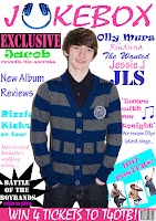


The poses of both these images are the same as the original image I had of my other model. In the one on the left, the model has blue stipes in his clothing, this makes the images fit my colour scheme, and blue is a consitent colour on my cover. In the one on the right, my model is in a grey top, although this doesnt like to my colour scheme, I quite like the image. I think that these images work better than my original one, and I personally think the image now helps to connote the pop genre better.

 As well as changing the image, I also experimented with changing my masthead slightly. I tried to somehow make it stand out more, and this is the outcome from it. I'm not sure of which I prefer, so am going to carry out a poll on my blog to see what cover out of the four that my target audience prefer.
Thursday 9 February 2012
First Contents Page Draft
Here is my first draft of my contents page. I have gathered some feeback from my target audience and here's what they came up with...
The good points are:
-it is very colourful
-has a very noticeable and recognisable genre
-clear page number listings
-clear heading to divide up the contents
The not so good points are:
-there are a few missing numbers on some of the contents
-need to add an online advertisment
-add Jacobs name
-check some spelling and grammar mistakes
-add page number to the actual contents page

Tuesday 7 February 2012
Favourite Images
Below are my favourite images which I took from my new photo shoot.

 Front cover ideas:
These are my favourite two front cover images. I have got my model doing the same pose as the model I had in my magazine before. This means I can easily jst put the image in and won't have the trouble of having to alter all of my cover lines. I am still undecided of which image out of the two I am going to use. The one on the right would probably fit best as the cardigan has blue stripes in which would help to create more of a consistent colour scheme. However, I quite like both these images, I am going to place them onto my magazine and decide on which one I prefer.

Contents page idea:
The image on the right is the image I am planning to have on my contents page. The model is in different clothing which helps to create a sense of variety. I also taken a more close-up shot to ensure my images are all varied and interesting. I think that the jumper works well and connotes what artists in the genre of pop would wear. He has direct eye contact with the camera again, which helps to engage the audience and persuade them to read on through the magazine.

Double page spread ideas:
 These are my two favourite images for my double page spread. They are quite similar as in the facial expression but the pose slightly varies, and the clothing is different. I am planning to have either one of these images on the left hand side, and then the interview on the right. I am undecided on which one to use, so I will have to see which one fits in best.
Sunday 5 February 2012
New Photo shoot
Wednesday 1 February 2012
Market Research


 I carried out some research as to the type of things guys in boybands woud wear. My target audience felt that my original image was not suitable for my magazine. So to ensure my new images would fit better, I carried out some market research as to the type of things I could get my model to wear. This was useful to me and hopefully my target audience will feel that my new images are more suited to be in my magazine. I looked at some a variation of different images and got a mixture of different clothing
 ideas; including, polo tops, v-neck, jumpers, cardigans and coloured hoodies.
Subscribe to:
Posts (Atom)