Monday 26 March 2012
Sunday 25 March 2012
Evaluation Question 5...
How did you attract your audience?
Here is a video of me talking about some ways in which I have attracted my audience in my 3 pages. I went back to my questionnaire results that I carried out at the beginning of the year and have talked about how I took the results of my target audience into consideration:
Below I have created a quick animation of some feedback that I got from my target audience. The member of my target audience that I got feeback from did not want to be filmed and therefore, I decided to write down her responses and then put it into this animation:Throughout the creation of my pages, I have been getting lots of feedback from my target audience of ways in which I could improve my documents firther. This slideshow shows how my pages hav developed:
GoAnimate.com: Magazine Feedback. by KayleeH1234
Like it? Create your own at GoAnimate.com. It's free and fun!
Saturday 24 March 2012
Evaluation Question 4....
Who would be the audience for your media product?
Below is a mind map showing who the audience for my products would be. To sum up the mind map below...my audience for my magazine is teenage girls ranging from the ages 10-17, they would be into all the chart music, keep up-to-date, fun, socialable, love going to concerts and love a range of pop music artists.

Friday 23 March 2012
Distribution Comic Strip...
Below is a quick comic strip, I created it to show the progress through from creating my magazine, distributing my magazine and people consuming my magazine...
Thursday 22 March 2012
Wednesday 21 March 2012
Monday 19 March 2012
Product Placement.

Saturday 17 March 2012
Thursday 15 March 2012


Thursday 8 March 2012
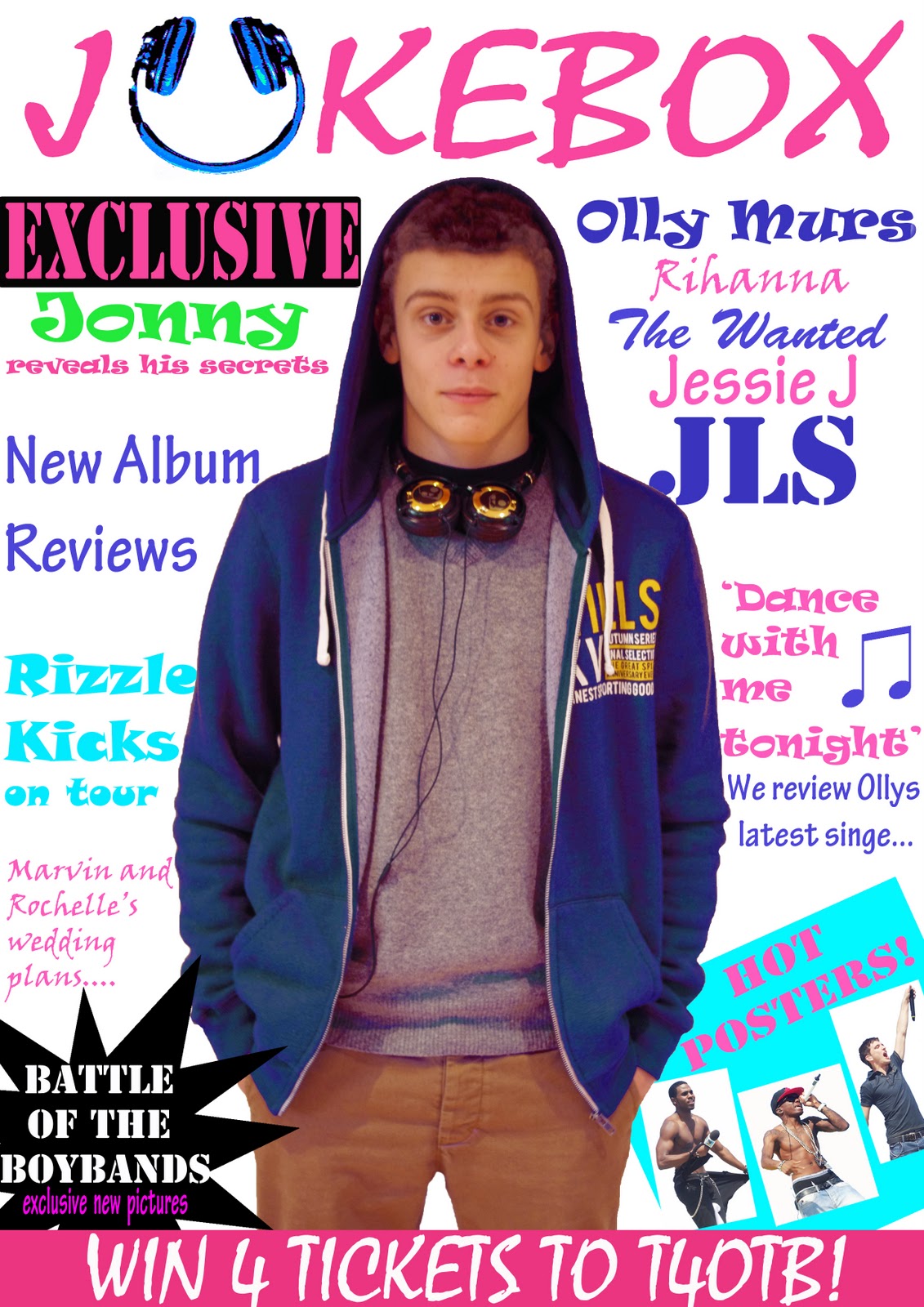
Final Cover
After carrying out the question below, I added up a tally to see which cover was the most popular with my target audience. Both the bottom two covers were equal winners of the question, it was thought that in those two, the pink masthead makes the magazine stand out a lot more. I decided to go with number 3. This is because I thought that the dark grey and blue cardigan in it stood out a lot more than the grey jumper in the other. Also, in my double page spread my model is wearing the grey jumper, so in order for my three pages to be more varied I went along with number 3. I also made some slight changes to my cover, when talking to my target audience they believed that some yellow needed to be added to the page so that it links better with the other two. So, I have added a yellow cirle and changed a little bit of the font to being yellow...


Deciding upon my final magazine front cover...

Monday 5 March 2012
Sunday 4 March 2012
1st draft of DPS

Here is my first draft for my DPS. I got some feedback of the good and bad aspects of my page...
The good points were that:
-very colourful
-eye catching image
-good lure ('exclusive')
The bad points were that:
-check spelling and grammar
-add a bubble behind 'debut album out now'
-change layout so writing isn't cut in half
The main point that I need to take on board from the feedback is the layout. At the moment, the text would be cut in half so I need to somehow alter this. It doesn't have the conventions of a DPS because of this issue so I need to think of ways in which I can alter this. I will make all the necessary changes to my page.
Thursday 1 March 2012
The Big 4
Here is a slideshow presentation on the 'big 4' major music producers of the last 10 years...
Wednesday 29 February 2012
Plans for DPS.
 Here is a photocopy of what I am planning to include in my double page spread. I have wrote out the questions I am planning to include and the responses for each. This is helpful as it means when I come to making my double page spread, it'll be a lot quicker as I have all the text planned out beforehand. I looked at some existing pop magazines to get an idea as to the sort of questions I should be asking, and here's what I came up with.
Friday 24 February 2012
Screen Recording...
Here is a short screen recording of me changing my front cover image. I placed my image onto my front cover and then cut round the image so the cover lines are visible.
Wednesday 15 February 2012
Changes to Front Cover:
I took my two best front cover images from my second photoshoot and decided to place them both on my magazine to see whether they fit well. I also added a barcode in the bottom right, making the magazine look more realistic and suitable to sell. Here are the outcomes:
(1) (2) 


The poses of both these images are the same as the original image I had of my other model. In the one on the left, the model has blue stipes in his clothing, this makes the images fit my colour scheme, and blue is a consitent colour on my cover. In the one on the right, my model is in a grey top, although this doesnt like to my colour scheme, I quite like the image. I think that these images work better than my original one, and I personally think the image now helps to connote the pop genre better.

 As well as changing the image, I also experimented with changing my masthead slightly. I tried to somehow make it stand out more, and this is the outcome from it. I'm not sure of which I prefer, so am going to carry out a poll on my blog to see what cover out of the four that my target audience prefer.
Thursday 9 February 2012
First Contents Page Draft
Here is my first draft of my contents page. I have gathered some feeback from my target audience and here's what they came up with...
The good points are:
-it is very colourful
-has a very noticeable and recognisable genre
-clear page number listings
-clear heading to divide up the contents
The not so good points are:
-there are a few missing numbers on some of the contents
-need to add an online advertisment
-add Jacobs name
-check some spelling and grammar mistakes
-add page number to the actual contents page

Tuesday 7 February 2012
Favourite Images
Below are my favourite images which I took from my new photo shoot.

 Front cover ideas:
These are my favourite two front cover images. I have got my model doing the same pose as the model I had in my magazine before. This means I can easily jst put the image in and won't have the trouble of having to alter all of my cover lines. I am still undecided of which image out of the two I am going to use. The one on the right would probably fit best as the cardigan has blue stripes in which would help to create more of a consistent colour scheme. However, I quite like both these images, I am going to place them onto my magazine and decide on which one I prefer.

Contents page idea:
The image on the right is the image I am planning to have on my contents page. The model is in different clothing which helps to create a sense of variety. I also taken a more close-up shot to ensure my images are all varied and interesting. I think that the jumper works well and connotes what artists in the genre of pop would wear. He has direct eye contact with the camera again, which helps to engage the audience and persuade them to read on through the magazine.

Double page spread ideas:
 These are my two favourite images for my double page spread. They are quite similar as in the facial expression but the pose slightly varies, and the clothing is different. I am planning to have either one of these images on the left hand side, and then the interview on the right. I am undecided on which one to use, so I will have to see which one fits in best.
Sunday 5 February 2012
New Photo shoot
Wednesday 1 February 2012
Market Research


 I carried out some research as to the type of things guys in boybands woud wear. My target audience felt that my original image was not suitable for my magazine. So to ensure my new images would fit better, I carried out some market research as to the type of things I could get my model to wear. This was useful to me and hopefully my target audience will feel that my new images are more suited to be in my magazine. I looked at some a variation of different images and got a mixture of different clothing
 ideas; including, polo tops, v-neck, jumpers, cardigans and coloured hoodies.
Thursday 26 January 2012
First Front Cover Draft
The strengths of my cover were:
-it is very bright and colourful
-a variety of fonts have been used
-very clear masthead
-it is symmetrical, with coverlines like wrapped round the image
-the bottom half, with the star and box stands out alot
The weaknesses were:
-doesn't immediately connote the genre of pop
-the image is more drum and bass type music
-need a barcode and price
-could add a light coloured background possibly
So, in order to improve on my cover, I plan on going out and taking more images. I need to make the model on my front cover image fit the genre of pop better. I may have to change the clothing to make it more like what guys in boybands would wear. I could also consider altering my masthead slightly, to again make it fit my genre better and to make it more 'girly'. I want viewers to easily recognise my magazine as being a pop magazine, so hopefully after the changes it would work better and immediately connote the genre of pop without any confusion.
Monday 23 January 2012
1st video...
Here is my 1st video blog entry. I have spoken a bit about the progress of my magazine so far, the problems I have encounted and what I am planning to do next.
Sunday 22 January 2012
Best images from concerts.
Here are my best images of some of the music artists I have seen at concerts. I have edited the images making them all have white background, so it is similar to my front cover images. I am thinking of using some of these pictures on my contents page. My favourites are probably the ones of olly murs and the one of tom from the wanted.
Best Images from 1st photo shoot.
Here are my favourite 3 images that I took on my first photoshoot. I edited them all making them have a clear white background.

I like the positioning in this image, and think it could work well with cover lines running down either side. However, I don't think he is looking directly at the camera, his eyes are looking up slightly. This may not be the best one to use as I want my cover to draw people into reading my magazine, so because he is not looking directly at the camera I will not use this image for my front cover. Also, there is a bit of a shadow on his jumper which looks a bit strange so if used I would have to edit this out.


 I like the matching colour of gold/ yellow in this image, with the chinos, band around headphones, and the writing on the hoody all slightly matching. Again, I like the positioning and think this could work well with cover lines running down either side. I like the clothing and think it could work well as a front cover image possibly. If I were to use this image, I would probably brighten it up more and make the hoody more of a brighter blue than a navy blue(like the image on the right). I think this one is my favourite, and will experiment to see if it looks right on my front cover.
I like the bright blue clothing in this image and it could link well, as i am planning to have a blue/pink/white colour scheme. This image is a slightly closer shot than the other two. I do think however, If I were to use this image I would go back to the original and edit it again, as I haven't cut round it smooth enough I don't think.
Wednesday 18 January 2012
My images from concerts
Above are some of my images that I have taken from the concerts I have been to. I have decided to include these in my blog as I may consider using some of these images on my contents page. I am going to choose my favourites and edit them, to see which ones look best.
Tuesday 10 January 2012
1st photo shoot
Here are some of the images I took on my photo shoot. I was unable to find a white wall, so will have to edit my pictures to make the background white. After taking these photos, I have decided that i prefer it when he is wearing headphones to when he is not. I think that by including headphones it helps to connote that it is a music magazine, whereas if they aren't included it may be difficult for viewers to work out the type of magazine just by looking at the picture. I am going to edit my favourite images from this photoshoot and then see which one I prefer as my front cover image.
Friday 6 January 2012
Filming Schedule
Location | Date and time | Shot type |
White Walls | Sat 07 Jan (1st model) | |
14:00-15:00 | Medium – close-up | |
15:00-16:00 | Long-medium | |
White Walls | Sun 08 Jan (2nd model if needed) | |
19:00-20:00 | Medium – close-up | |
20:00-21:00 | Long-medium | |
Beach | Some other point if necessary |
Above is my filming schedule, I have roughly planned out the date and times I am going to carry out my shots. I have also added the shot types that I may experiment with at particular times. Although my photoshoot may not go exactly to time, I have planned it out to ensure that I am organised and am able to get my images done.
Subscribe to:
Posts (Atom)