
Tuesday 20 December 2011
Thursday 15 December 2011
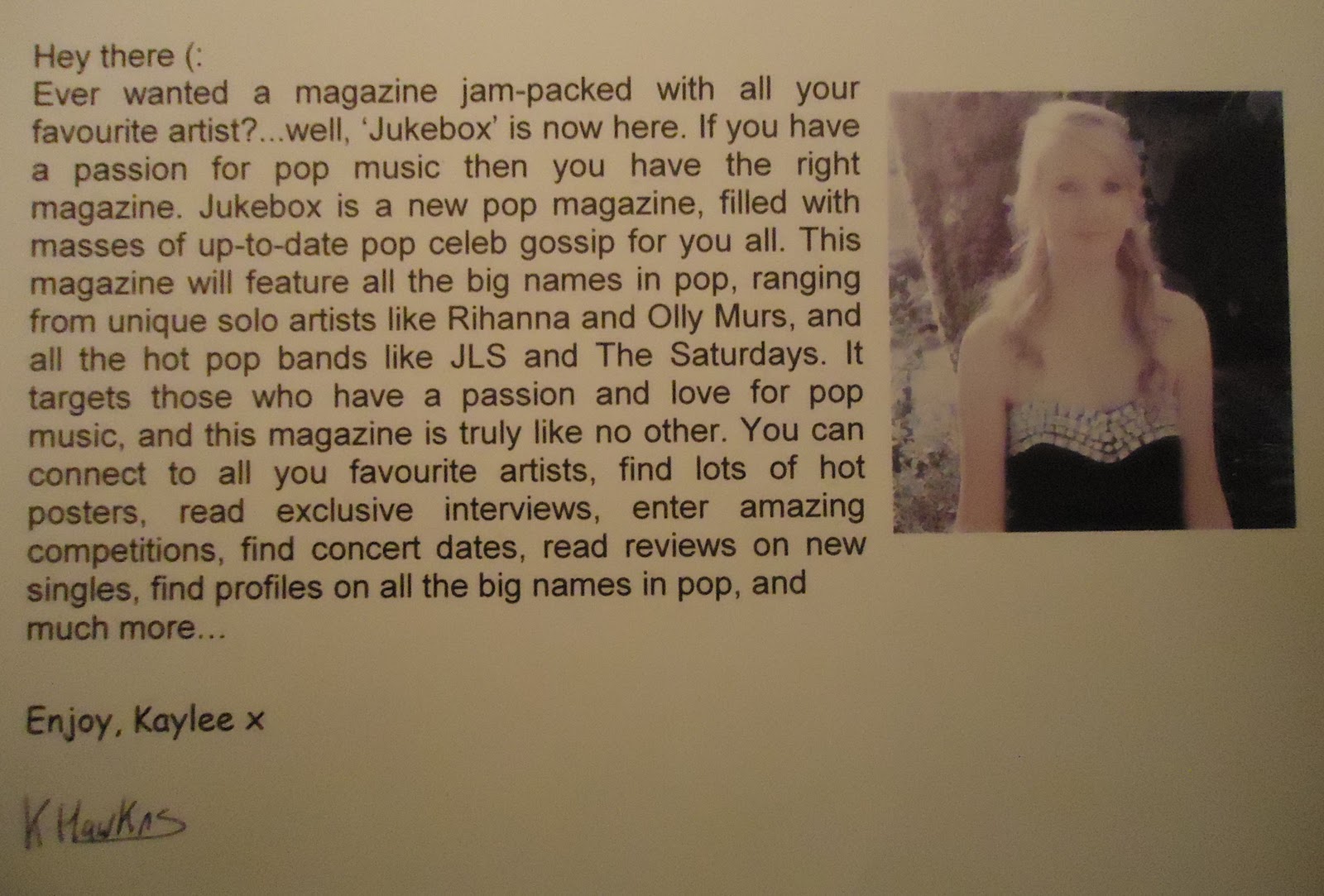
Flat Plans...
Below are my flat plans of my front cover, contents and double page spread. I have roughly drawn out where I would preferable like everything to be and have put all my ideas together to create these three rough sketches as a guide to help me when I come round to creating them on the computer.

I plan for my front cover to have the masthead uncovered by any images/coverlines. I may decide to have it in a coloured box, I want it bold and eye catching. I plan for my image to be in the centre of the page, with coverlines either side of it, making it have a sort of symetrical effect. Also, I would like to have a suitable amount of coverlines so it doesnt come across as looking 'overcrowded'. I plan to try and make all the main coverlines stand out, possibly by putting them in boxes/circles, or by having them in a different font to the rest.

I plan for my contents also to have the title uncovered and eye catching. I would like my main image to be on the left/centre allowing room for the main contents information. Also on my contents, I would like there to be a mixture of both images and text, rather than it just being a page full of page numbers and writing. I plan to have pictures of the pop artists that would feature in my magazine down the right hand side. Some ideas for the contents of my magazine include; hot posters, new artist profiles, awesome competitions, album review and concert dates.

This is my plan for my double page spread, again I want a clear title and a mixture of both images and text. I would like the main image to be on the left, with the interview (text) justified to the right of the image. I plan to include boxes/circles to help to highlight some of the main bits and make them stand out from the rest; including the main quote, concert dates and possible new album or single.
Storyboard of Shots

 Here are my story boards of shots that I plan to take when carrying out my photo shoot. Underneath each drawing I have listed some of the key mise-en-scene elements. This is helpful as it helps to prepare me as to the type of photos I may take, it is only a rough plan, but I will keep all these 8 shots in mind when taking my images. By doing this, I was able to gain more of an idea as to what poses I like, and when I do my photo shoot I will be more confident as I now have more ideas that are continuing to develop.
Sunday 11 December 2011
Media Theories!
When creating my magazine, I have to take the different media theories into consideration, one of the main ones being ‘Audience theory’. Audience theory helps to show the vast change within media over the years, and there are lots of different concepts within.
Hypodermic Needle Theory is the idea that media can easily influence a large group of people without any opposition. It was believed that mass media can ‘inject’ messages directly into its audience, who will immediately be influenced by it. In contrast to this, Halloran stated ‘We must get away from the habit of thinking in terms of what the media do to people and substitute for it the idea of what people do to the media’.
The quote is suggesting that people are now getting a lot more involved as to what they want in the media. It tells us that instead of just passively accepting the media we are now more involved and can interact with it. Nowadays, we have a choice as to what media we want to experience, whereas before people had no choice, we can be more selective about types of media, and people nowadays influence the media more, rather than before when the media was massively influencing us.
The Two Step Flow theory is the idea that media starts off with individuals (opinion leaders) who pass on their interpretations/ personal influences of the media to others. It states that the majority of people are influenced by the media second-hand, through the beliefs and personal experiences of the opinion leaders.
C.Wright Mills came up with four functions of the media for its audience:
- give individuals identity
- give people goals and aspiration
- give instructions on how to achieve these goals
- give people an alternative if they failed (escapism)
When creating my front cover, contents and double page spread, I am going to take all the media theories into consideration. I want my magazine to be unique and have a ‘diversion’ in order to get people to escape from their everyday lives. Also, I want my magazine to have a sense of ‘surveillance’, so my readers can know what’s going on in the world of pop, in order to give them goals and aspirations they may wish to achieve, and points on how exactly their goals can be achievable.
Thursday 8 December 2011
Risk Assessment
Risk Assessment for my photo shoot:
I am planning on doing my photo shoot in my house, preferable in a room with white walls. Below is my risk assesment, it ensures that my photo shoot will be carried out safely, I have identified some of the possible risks and then ways in which I could prevent it from happening. I decided to include this to show that my photo shoot will be carried out safely, and hopefully reducing any problems from occuring.
RISK | PREVENTING RISK |
Falling down stairs | Make sure we take care when walking down and up the stairs |
Dropping camera equipment | Make sure the camera is in a case until it is needed |
Tripping over dogs | Make sure the dogs are out of the room when taking the photos |
Hurt self when moving furniture about | Make sure we move it about carefully and slowly |
Getting fingers trapped in doors | Make sure we take care when walking in and out of rooms |
Dogs may ruin the photo | Make sure dogs are out of sight to avoid them ruining any of the photos |
Might trip over junk on the floor | Make sure the house is tidy with no obstacles that we may end up tripping over |
Tuesday 6 December 2011

Saturday 3 December 2011
Masthead Ideas


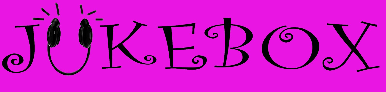
I came up with three different masthead ideas. Each of which are slightly similar but with some slight differences to it. I think the top one is quite girly and would suit well, however I believe that it isn't really bold enough. I want my masthead to be extremely clear even at distant so if on a magazine shelf, it would be immediately seen. The second masthead is my chosen one, I think it stood out the most, it is very clear and bold, and I think the bold capitalised letters stand out a lot. I don't really like the last idea, I don't think it stands out enough. It is a very girly font, but I don't think it would work well as the letters aren't bold enough and it isn't as eye catching.
Thursday 1 December 2011
Hand Drawn Logo/Mathead Ideas.

Subscribe to:
Posts (Atom)