

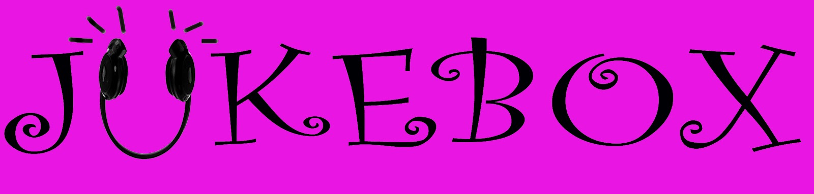
I came up with three different masthead ideas. Each of which are slightly similar but with some slight differences to it. I think the top one is quite girly and would suit well, however I believe that it isn't really bold enough. I want my masthead to be extremely clear even at distant so if on a magazine shelf, it would be immediately seen. The second masthead is my chosen one, I think it stood out the most, it is very clear and bold, and I think the bold capitalised letters stand out a lot. I don't really like the last idea, I don't think it stands out enough. It is a very girly font, but I don't think it would work well as the letters aren't bold enough and it isn't as eye catching.
No comments:
Post a Comment