I took my two best front cover images from my second photoshoot and decided to place them both on my magazine to see whether they fit well. I also added a barcode in the bottom right, making the magazine look more realistic and suitable to sell. Here are the outcomes:
(1) (2) 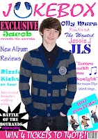


The poses of both these images are the same as the original image I had of my other model. In the one on the left, the model has blue stipes in his clothing, this makes the images fit my colour scheme, and blue is a consitent colour on my cover. In the one on the right, my model is in a grey top, although this doesnt like to my colour scheme, I quite like the image. I think that these images work better than my original one, and I personally think the image now helps to connote the pop genre better.

 As well as changing the image, I also experimented with changing my masthead slightly. I tried to somehow make it stand out more, and this is the outcome from it. I'm not sure of which I prefer, so am going to carry out a poll on my blog to see what cover out of the four that my target audience prefer.
No comments:
Post a Comment